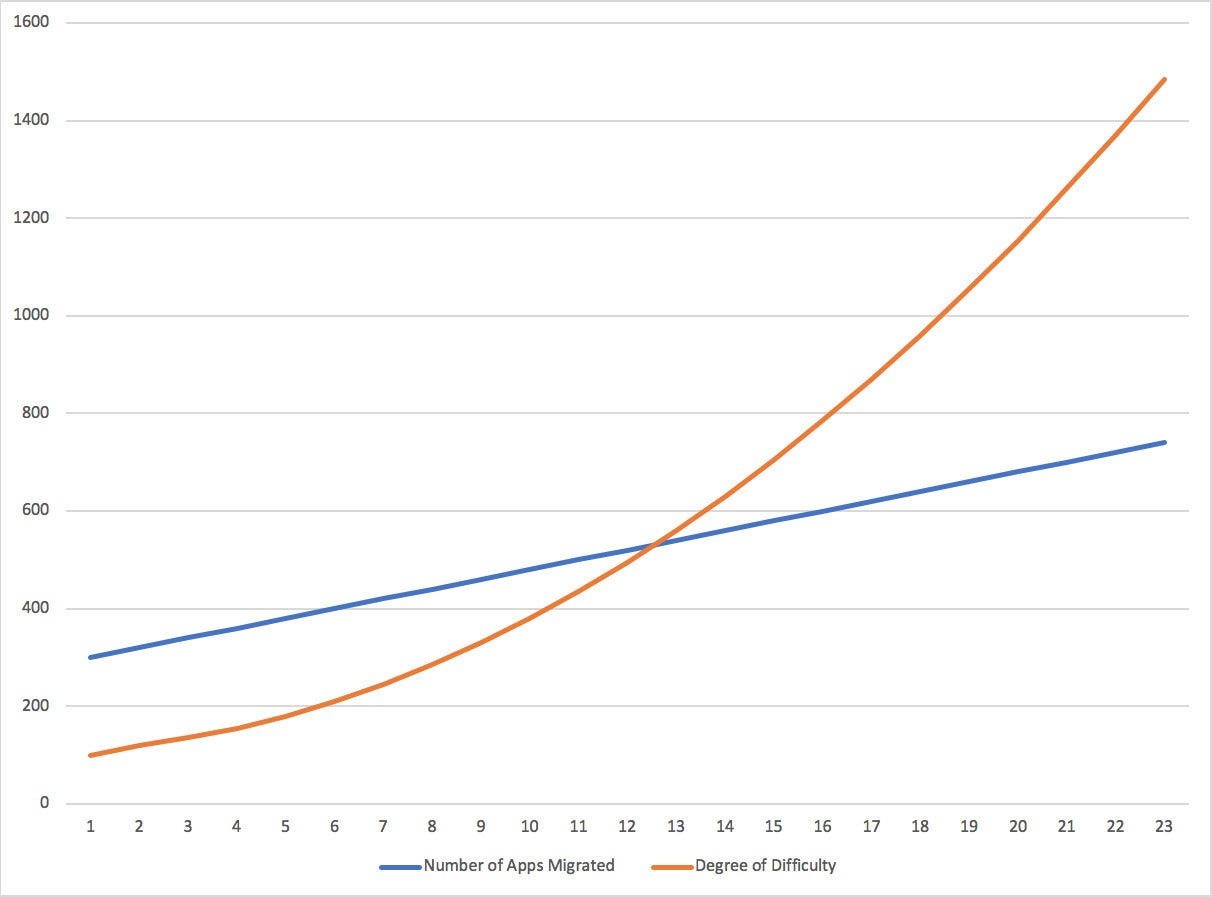
The chart below depicts the number of applications migrated over time in blue, and the degree of difficulty of moving those applications in orange. This is a fictional collection of applications; however, the concept that difficulty increases the more you migrate affects enterprises large and small as they move to the public cloud.
See this chart:
 IDG
IDGWhat’s occurring is easy to explain, but the solution to the problem is not.
I am very thankful to you that you have shared this information with us. I got some different kind of knowledge from your web page, and it is really helpful for everyone. Thanks for share it. Read more info about Expert Devops Services
ReplyDelete